Make Footers Stick to the Bottom of the Page in Bulma

Many websites feature a footer element which should be displayed as the last element on a website. Everyone that created a footer stumbled upon this problem at least once: For shorter pages, the footer is the last element, but it's not at the bottom of the screen. It's somewhere in the middle of the screen with space below it.
In Bulma, the footer class can be altered to always be at the bottom of the viewport by enlarging the element right before the footer to fill the remaining space. This ensures that there is no blank space on below the footer.
This behavior can best be achieved by using the flexbox layout. Let's dive into the details on how to implement this behavior and more:
Theory
I want to quickly explain the theory behind the problem for more inexperienced developers, so they understand why this problem happens and what the idea behind the solution is. This is important to know and allows you to transfer your knowledge to similar problems more easily. But you can of course skip this section and jump straight to the Non-Theory heading below.
The Problem
Websites have certain rules that determine how DOM elements in general are positioned and rendered. In our case, the footer element simply gets rendered right below its sibling, which is the intended behavior for DOM elements.
For the footer however, we don't want this. The empty space below the footer is a result of all elements total height being smaller than the viewport height. This leads us to the solutions (or one of the solutions):
The Solution
The height of the content to the top of the footer would have to be larger by the amount of space below the footer. One could add <br/> tags or something else that occupies space so the footer gets pushed down, but this would be an anti-pattern since you shouldn't modify the content in order to change the design. Those two should be separated at all times.
Rather, the solution to go for is to increase the height of the element to the top of the footer (or any element to the top of the footer really) by using CSS. Due to the existence of different display- and thus viewport-sizes, fixed heights are not a viable solution either.
Instead, we are going to make a layout that fills the remaining space automatically by using flexbox. Flexbox is a display-mode that allows an element to display its child elements in a distinct and flexible way (hence the name).
Non-Theory
Here is a rough sketch of a basic website with header and footer:

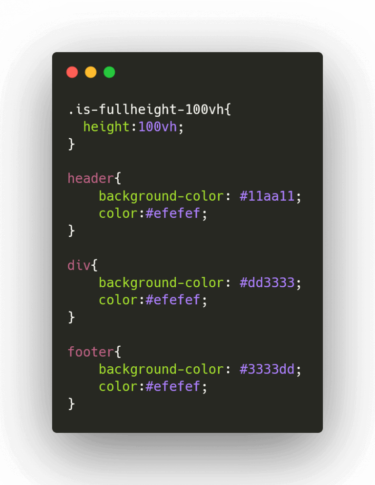
So in order to have the blue footer part always end at the bottom of the screen, the height of the red main content part has to fill the remaining height. In Bulma we can simply achieve this with the following HTML code:
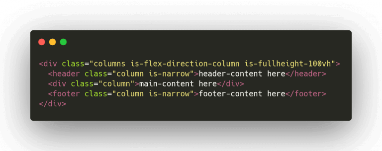
And the following CSS code:
I've also put the code on CodePen for you, so you can simply copy it or look at the result. With this flexbox technique you can also build similar layouts horizontally (for a fixed width menu on the left and fill the remaining space with content) and many other things.
Addition: How to do that without Bulma
Maybe at some point of time you'll be in the position where you have to realize this behavior without Bulma - it'll be nice to know what the Bulma classes do in the background so you can do it yourself or in other frameworks like bootstrap.
Basically the columns class applies display-mode:flex to the wrapper and the is-flex-direction-column class applies flex-direction: column. We then add height: 100vh to the wrapper so it always fills the screen.
The column class applies several CSS values but most importantly it applies flex-grow: 1 so the child elements grow until the parent element is filled. With the class is-narrow we set flex-grow:0 for the elements we don't want to grow (so they only take up as much space as they do without flex). That's it.
I hope that you learned something and that this was helpful for you. Please like, subscribe and share - jk, computer scientists like us don't have any friends to share with :P